


By Kevin Slimp
My experience as a professional designer goes back quite a while. … Skip ahead a few decades to 2021, and quite surprisingly, I find myself doing more design work than ever. Between book covers, marketing materials, and even the occasional newspaper redesign, I generally sit in front of my screen 12 or more hours most days. So, when I find something that saves time in the design process, I’m quick to add it to my toolbox.
I’d like to share two websites that have become daily destinations in my design work in this column. I use both to assist in the selection of colors used when designing book covers and marketing materials. Not only do these tools save time, but they’ve also made the quality of my work increase significantly.
The first is Design Wizard (designwizard.com). The actual URL you will want to visit for selecting color combinations is:
designwizard.com/blog/deshttp://designwizard.com/blog/design-trends/colour-combinationign-trends/colour-combination
As you scroll down the page of Design Wizard, you’ll find a section titled, “Color Compos That Use Two Colors.” I’ve started using this material in most of my design work. Design Wizard features popular color combinations that work well together. For instance, I would have never thought to use Turquoise and Warm Sand together on a book cover. But with the help of Design Wizard, I did, and the result was a beautiful color combination.
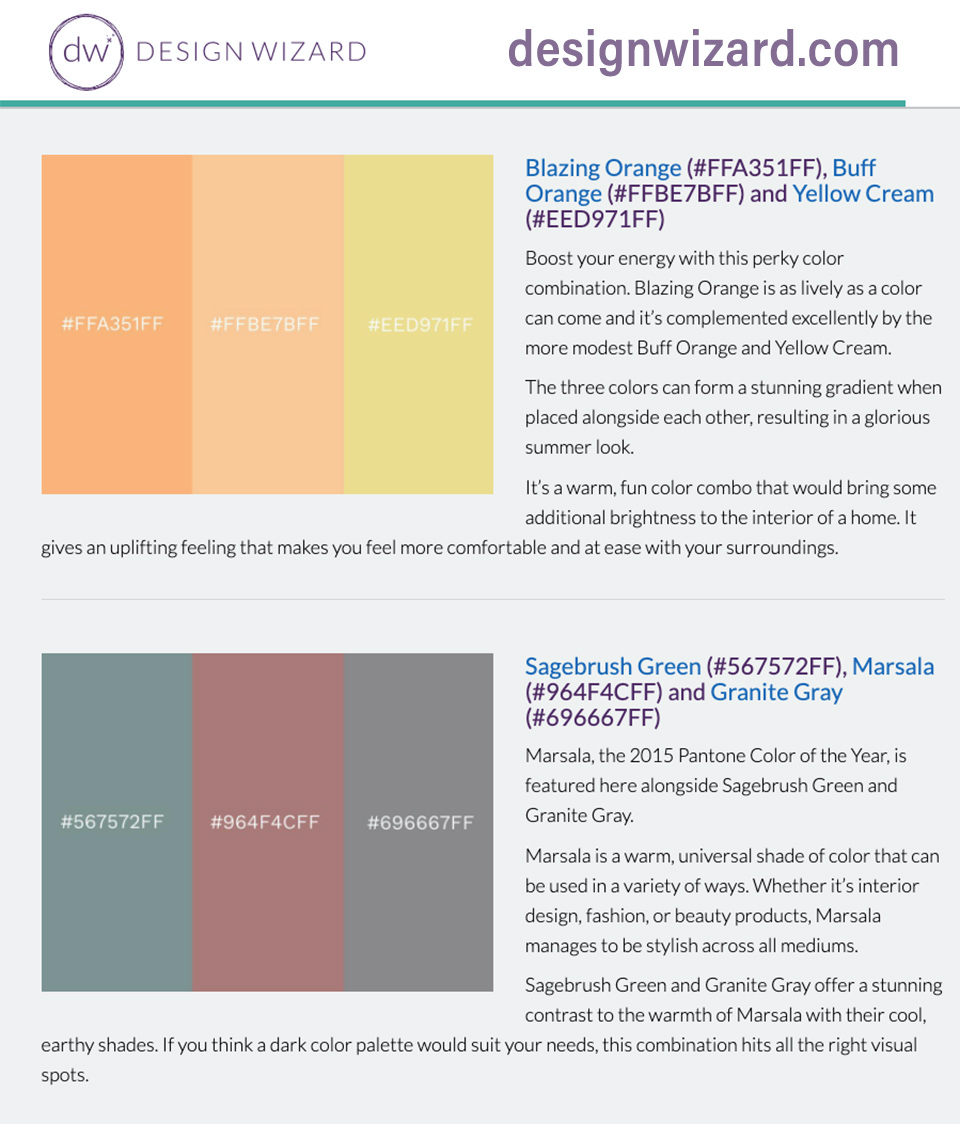
Further down the Design Wizard page, you’ll find a section titled “Color Matching with Three Colors.” If you are like me, you’ll find this information invaluable when designing ads and illustrations.

The second website I would recommend is Pantone Harmonies, found at:
connect.pantone.com/#/harmonies
Be sure to enter the URL address precisely that way. Otherwise, it’s tricky to find the right page.
Simply, Pantone Harmonies allows the user to enter a color, then suggests complementary colors.
I’m currently designing covers for 23 books in a series. Each has a similar design but uses its own unique color combination, different from the colors of the other book covers. You might imagine how difficult it was to find 23 different combinations that looked modern and appealing. Pantone Harmonies has been a lifesaver. I simply enter a color. If I enter something generic, like “green,” the website will list all the various Pantone colors in the green family. After selecting the green I want to use, Pantone Harmonies lists color combinations, most of which I would have never imagined on my own.
If you don’t deal with colors or design at your publication, send this column to someone who does. There’s a good chance they will thank you for it later.